Ad blocker detected: Our website is made possible by displaying online advertisements to our visitors. Please consider supporting us by disabling your ad blocker on our website.
Jim, i did think about weight at the bottom but felt the symmetrical nature of the mount and moulding worked well together
ormond,my customers are used to my forthright explanations of things, i do straight talking with them and it seems to work
richard yes artglass would be good. i guess i gonna have to go for claryl as no one brings anything else of that level into ireland would you belive`!!!
stcstc wrote:\
ormond,my customers are used to my forthright explanations of things, i do straight talking with them and it seems to work
I'm not sure what you mean by that, but I was just saying that it's a great design and quite a step up from a single rectangular mat!
I reckon that if you were to have some examples of designs such as this one, displayed in your shop, you would sell more of them. That applies to me too!
Steve,
I agree with you about straight talk! No sugar coating for me either when dealing with customers. Give 'em the facts, show 'em some designs, then let 'em decide, take their deposit and do the job.
I'm sure that when shown your design on that image and another one with a single white mat and the same frame, the majority of people would prefer your design.
After 26 years I still haven't made a set of framed examples of the same print. I think I may be procrastinating, but I haven't made my mind up about that yet.
Steve that looks very good. Only 2 small criticisms and they are only my opinion.
It could have done with a drop on the bottom. If I do a 4" top and sides then 5" at the bottom.
Secondly, the fancy stepped mounts corners are not doing it for me. The rest of the piece especially the moulding is very clean linear lines, it doesn't need those corners IMHO.
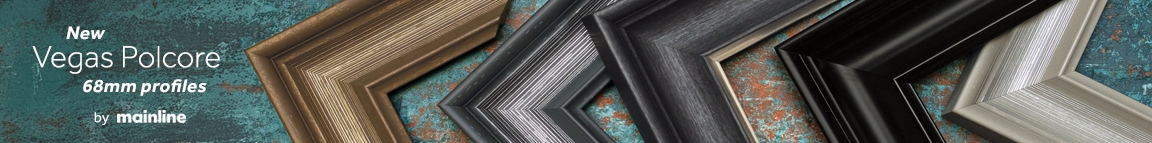
Is the slip grey or black if it is grey good choice sets it apart from the norm.
Great looking frame a good example of what you can do instead of the usual square black frame and double mount that most people demand for a photo. Well done.
Yes with the steps you are probably right, however I still would have done away with the steps. Having said that you have obviously got one happy customer who will go away and tell their friends what a fab job you did, so in my book that is a spot on framing job.
I first saw this yesterday and my first response was 'its against the law'. What law?? I wasn't sure I'd seen it ever written down but when I first started to learn mount cutting and decoration the rules of design were 'All decoration/mount layers should be in the 1/3 of the mount nearest the image'. But I had to keep going back and looking at it.
Conclusion – Nicely broken rules. I think this works beautifully. The frame that is not the mutt’s hairdo, that does worry me.
SarahO (Sarah from Gunnar but not with my Gunnar hat on)